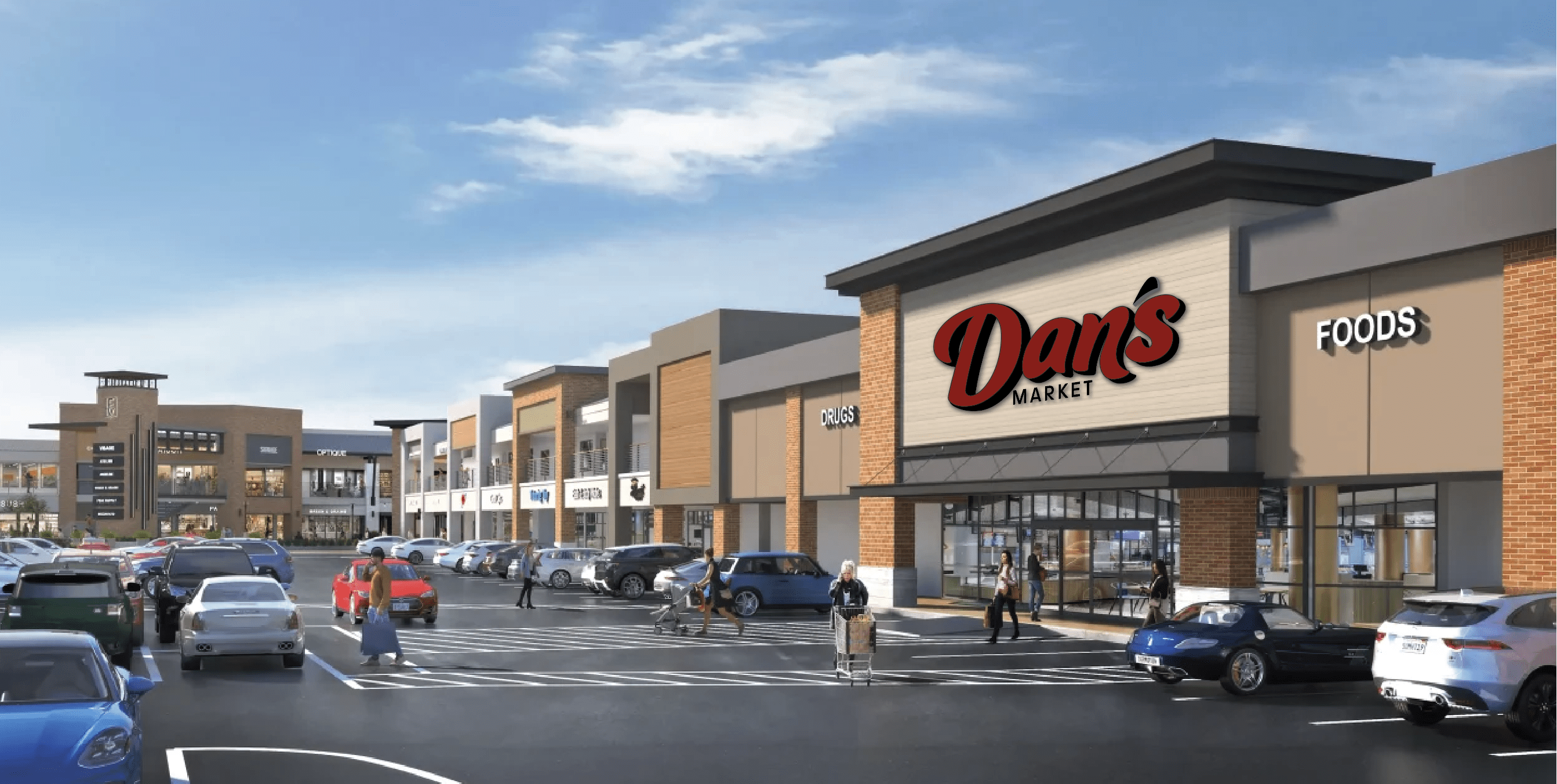
Dan’s Market, a brand that’s been part of Utah’s grocery landscape for more than 100 years, is stepping into a new chapter with a redesigned logo that honors its heritage while positioning the brand for continued success. Dan’s, the longest-standing brand among the corporate stores, is refreshing its look as part of a major remodel at the Foothill location in Salt Lake City.
“This update is about more than just a new look, it’s a statement about who we are and where we’re headed,” said Darin Peirce, executive vice president and president of ARO. “Dan’s has always been a pillar in our company and this evolution reflects our commitment to keeping it vibrant and relevant for the next generation.”
The new logo, which will appear at the Foothill store by the end of May, represents a strategic evolution with design rooted in tradition, but with a modern flair that reflects today’s grocery shopper.
Jade Romano, marketing specialist for ARO, said, “Dan’s has always stood for quality, care, and community. We wanted a logo that still felt familiar to our loyal guests, but that also speaks confidently to new shoppers looking for a forward-looking grocery experience.”
The new mark retains the deep red color associated with Dan’s for decades, symbolizing passion and heritage. However, the once-secondary orange has been replaced with black, which was a deliberate shift meant to convey strength, sophistication and timelessness. The updated typography features softer curves and an organic flow that offers a sense of warmth and human connection.
“In today’s visual world, a logo isn’t just a symbol – it’s a promise,” said Wayne Dalton, the AFS creative manager who led the logo redesign. “It tells a story in seconds. Our goal was to make that story one that is both rich and inviting.”
The redesign was spurred by the broader modernization of the Foothill Village shopping center and became an opportunity to evolve the brand alongside the physical space. The project was a collaborative effort between ARO’s leadership, AFS marketing and design and others. Decisions were guided by customer data, demographic research and the company’s long-term brand vision.
“The updated logo signals that the Dan’s brand is as strong today as it has been throughout the long history of Dan’s.” said Greg Welling, vice president of retail operations. “It ties us to our legacy while positioning us for the future. We are ready to provide today’s shoppers with great service, high-quality products, and connection with the community.”
The new logo will roll out digitally first on the Dan’s website, social channels and marketing materials, with physical signage, packaging and uniforms to follow in coming months. The Dan’s store on 70th South will retain its current logo until a future remodel, allowing the brand to strategically phase in the new design while aligning with store-specific updates.
Team member and guest feedback has already been overwhelmingly positive.
“People recognize the history, but they’re also excited about where we’re going,” said Jade. “That’s exactly the reaction we hoped for.”